US Digital Response
OVERVIEW
Client
US Digital Response
Scope of work
The challenge USDR is hoping to solve is to evaluate the effectiveness of the usdigitalresponse.org homepage for attracting work with government partners.
Outcome
This project is ongoing.
THE PROBLEM
Unresolved questions on how the website speaks to government representatives
When I joined this project, little research had been done to understand whether government partners, a key client group, felt the homepage effectively communicated the role of USDR plays and how to partner.
I worked with a content writer, UX researcher, and several USDR staff members.
Issue 1
The landing page didn't effectively communicate information specific to their key target groups of federal and state representatives.
Issue 2
Participants wanted to more specificity on what USDR could help with.
Issue 3
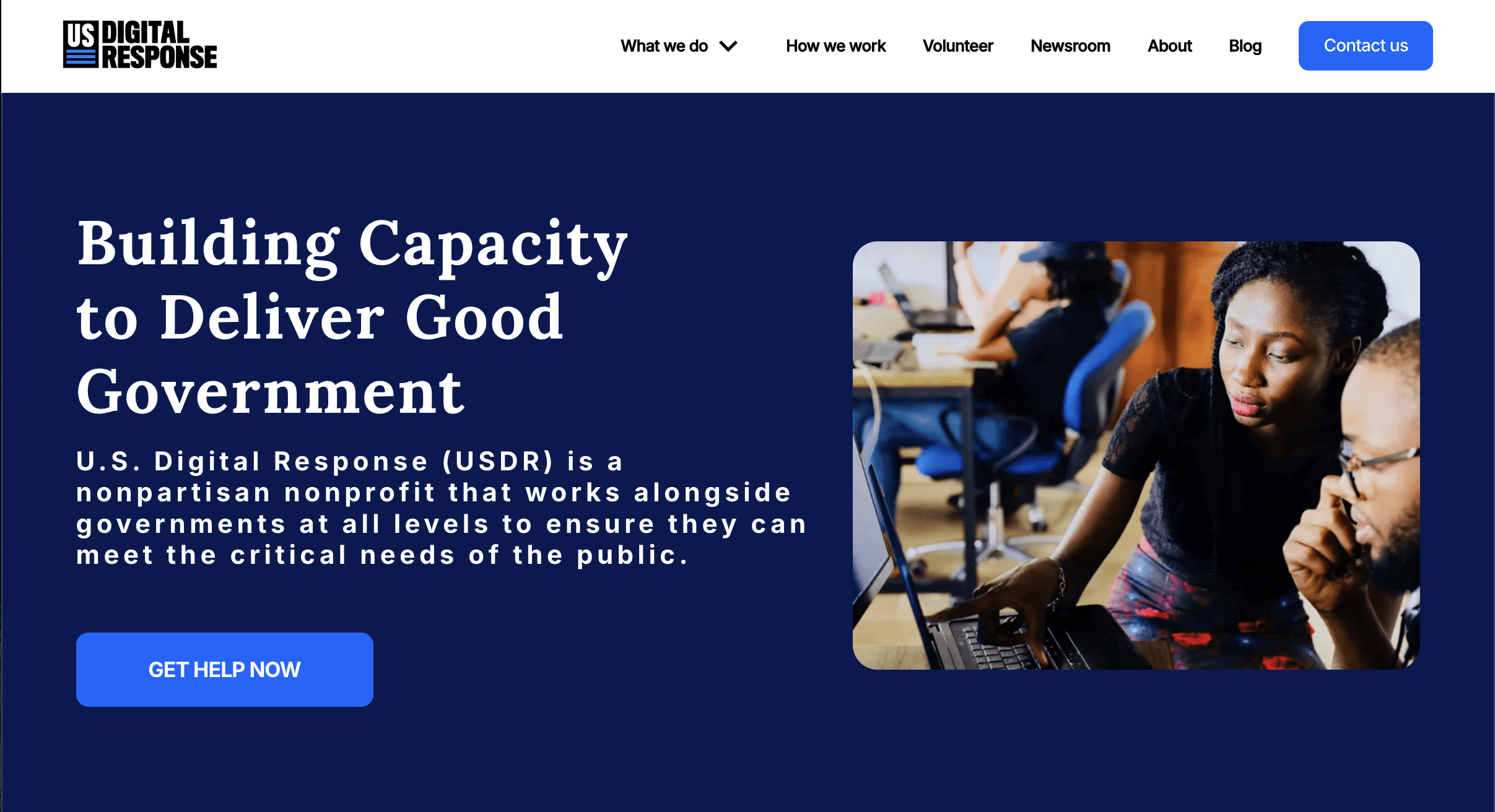
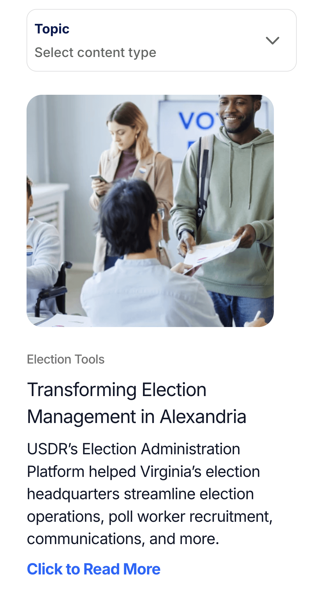
The illustrated hero image, a critical area to express a distinctive and resonant brand, received negative responses from participants.
Target Audience
Federal and State Organization Representatives
The purpose of the project was to increase the amount of federal and state organizations connecting with the USDR. We conducted moderated research with federal and state workers using the current site and prototypes.

State Workers

Federal Workers
Issue 1
Key target groups couldn't easily find information specific to their work
Participants wanted to filter information specific to their work as federal, state, and non-profit work and constraints are different. The work each group does also has incredible variety. The landing page's generalized approach failed to connect with participants who were frustrated they couldn't narrow in on content suited to them.
Issue 2
The tangible benefits were not clearly communicated
From research, users could not easily see the specific type of work USDR performed. There was a section that conveyed value creation in partnerships, but users wanted to see more specificity.

Issue 3
Hero image was not favorable
The hero illustration was not received well. It is a critical issue as the hero area is where the USDR brand provides its first impression and way to distinctively connect with an audience.
THE APPROACH
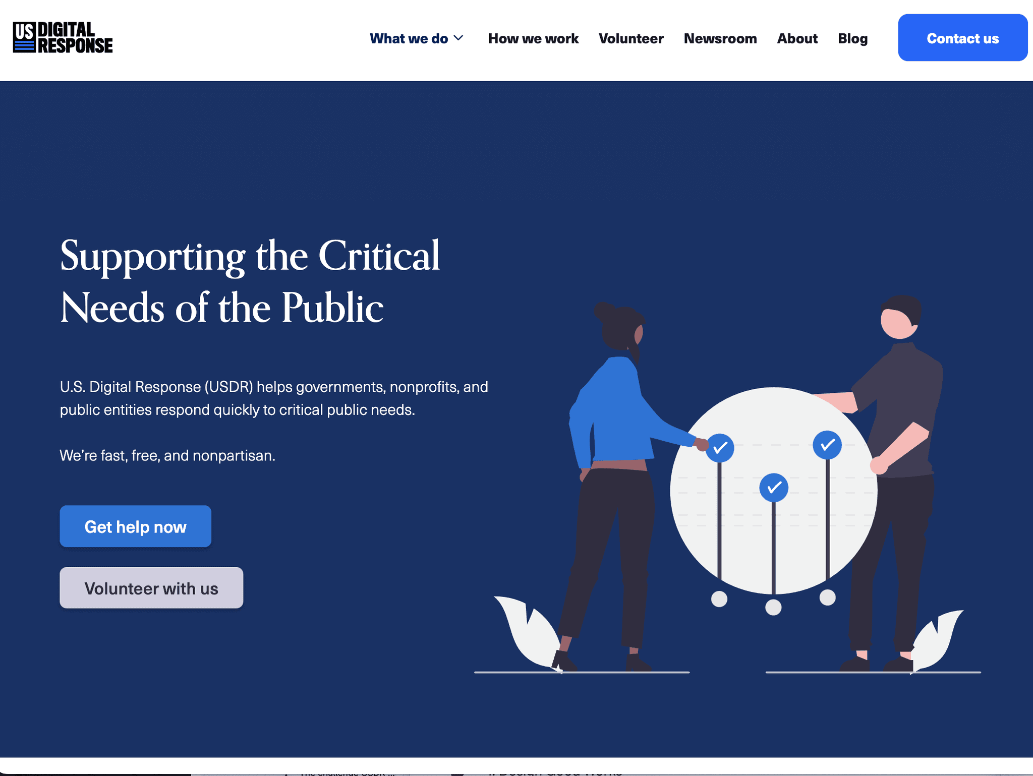
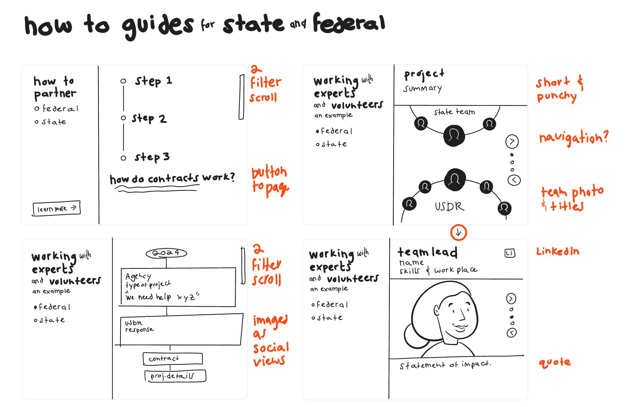
Create sections specific to key federal and state audiences who can quickly learn what a partnership could look like and how to get started.
To promote more federal and state audiences connecting with the USDR through the website, I proposed creating sections that could filter to provide content specific to state and federal groups. I created a new hero section using a photograph to make a positive and distinctive impression.
Solution 1
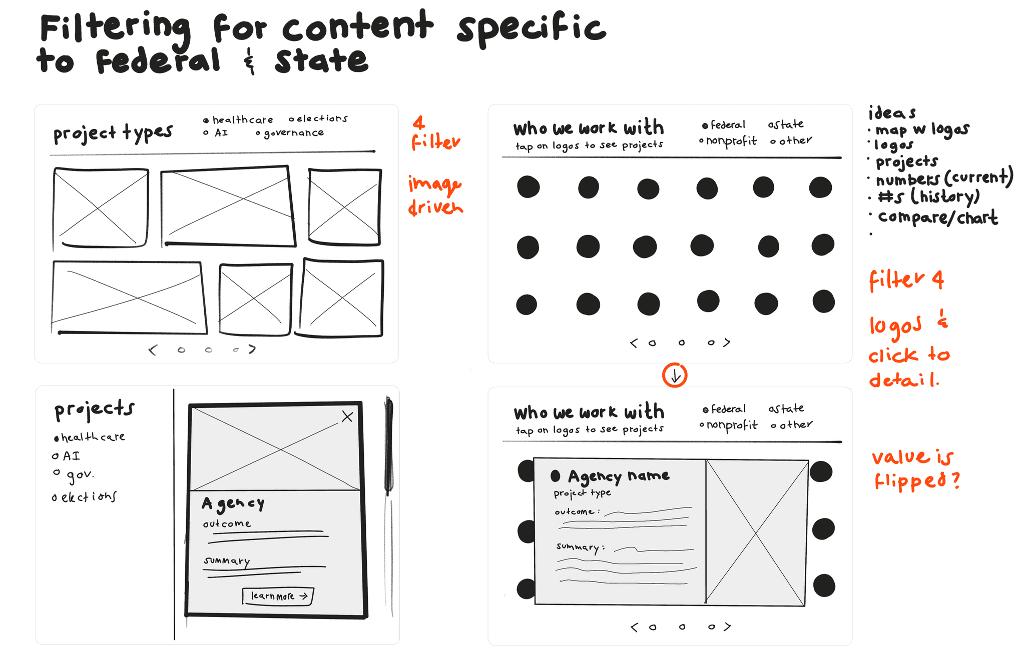
Creating a way to filter for content specific to federal and state audiences
To start, I sketched out and ideated around filtering navigations. A constraint was the complexity of filtering patterns that could be responsive and easy to implement by the website manager. In the end, the complex filtering patterns were changed to a pattern featured on their site.
Solution 2
Creating a sector-specific guide for the benefits of working with USDR
I sketched out and ideated around interactive guides that could show an evolving story of organizations partnering with the USDR. I ended up stripping down the complexity so the usability and content were simple and clear.
Solution 3
Creating a distinct hero more resonant to federal and state audiences
I started with several different iterations of images and content supported by the writer on the team. In this iteration, it felt to the user as if we were speaking to the public and not the audience we were trying to speak to - government workers.

In response to feedback and running up against time and brand constraints, we used an image already featured on the USDR site. This image did resonate for people wanting to see technologists working on an ambiguous problem.