OVERVIEW
Client
LuckyTruck
Scope of work
Update the web app product and elevate the onboarding to quoting experience by reducing the number of steps and cognitive load of users who are attemping to secure trucking insurance.
Outcome
Through three large platform updates and iterative updates, Version 1, V2, and V3 resulted in a 15% increase in users navigating the platform to successfully get a digital quote.
THE PROBLEM
A web product with a functional yet frustrating experience
When I joined LuckyTruck, the product functionally proved the theory that users could enter information and be served competitive trucking quotes. The usability of the platform was rife with issues and proper research had not been done to determine friction points or opportunities. Users found the experience confusing.
Issue 1
Limited user-research had been done on the product experience leading to users struggling with the journey from start to finish
Issue 2
The immense amount of information users needed to enter led to a field-filled experience that took a lot of time and energy on the users part
Issue 3
The app did not provide enough value after users pulled a quote or purchased a policy and additional features needed to be discovered
Issue 1
A bumpy journey from start to finish
When I joined LuckyTruck, the company was overhauling the entire platform design, but had limited user-research feedback leaving the product experience for users challenging. Additionally, brokers who helped to serve customers to get quotes were hesitant to use the app experience build for their use because of usability issues.
Issue 2
A time and information intensive experience
Trucking insurance is a complicated business that involves a great deal of risk of assets that need to be covered. The amount of information needed from truckers led to an experience that was filled with forms and took a long time and understanding of technical terms to complete. Through moderated interviews it became clear that most users, including brokers, could not complete the full workflow without confusion and frustration.
Issue 3
Limited post-policy value for users
When a trucker completed adding their information they were returned to a dashboard that provided little additional value to drive repeated use. Participants in moderated testing weren't sure what else they could do after they received a quote or purchased a policy. The 6-month or 1-year sign up window left many users not returning to the platform.
THE APPROACH
Reduce and clarify the fields truckers needed to fill in order to get a quote. Discover and deliver valuable post-purchase value features to encourage adoption.
From moderated interviews, it was clear that the workflow that users and brokers engaged with was challenging on several fronts. This led to a large drop of throughout the entire experience and limited adoption.
To promote usage of the product, I proposed reducing steps and any unnecessary fields that delivered friction on the way to getting a quote. We also became relentless to discover points of post-quote value truckers wanted. We were able to reduce the amount of fields by 75%, time on every section by an average of 5 minutes, for an overall reduction of time to quote to an average of 10 minutes versus 25 minutes.
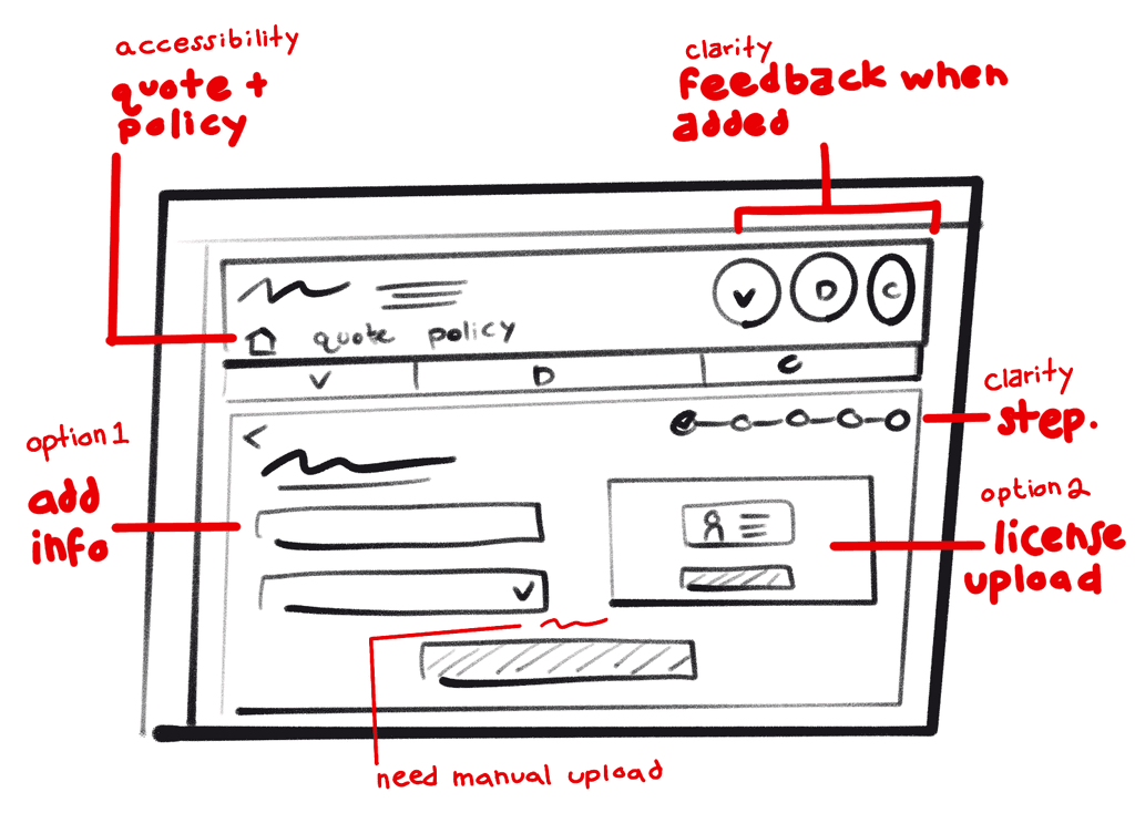
Auditing necessary fields, layout, and sketching possible solutions
To start, I conducted usability tests with brokers and truckers on functional prototypes to discover friction points specifically around the steps of adding vehicles, drivers, and commodities. Our team of engineers and PM audited what information was essential for getting a quote and the possibilities of using photographs of documents to pull information. We ambitiously questioned and eventually executed an extremely minimal data entry experience but with delightful and informative feedback for users.
From research, we learned users would be interested in uploading driver license and VIN information to pull information. To provide informative, functional, and delightful feedback, I created interactive animations that engineers could deploy and change states based on upload progress - loading, success, or failed. Feedback from users showed positive reception that turned the loading experience into one that increased understanding, trust in adding information in this way, and interest to continue in the flow.
Click this animation to see upload feedback for users
Exploring and prioritizing valuable features truckers need in their day to day
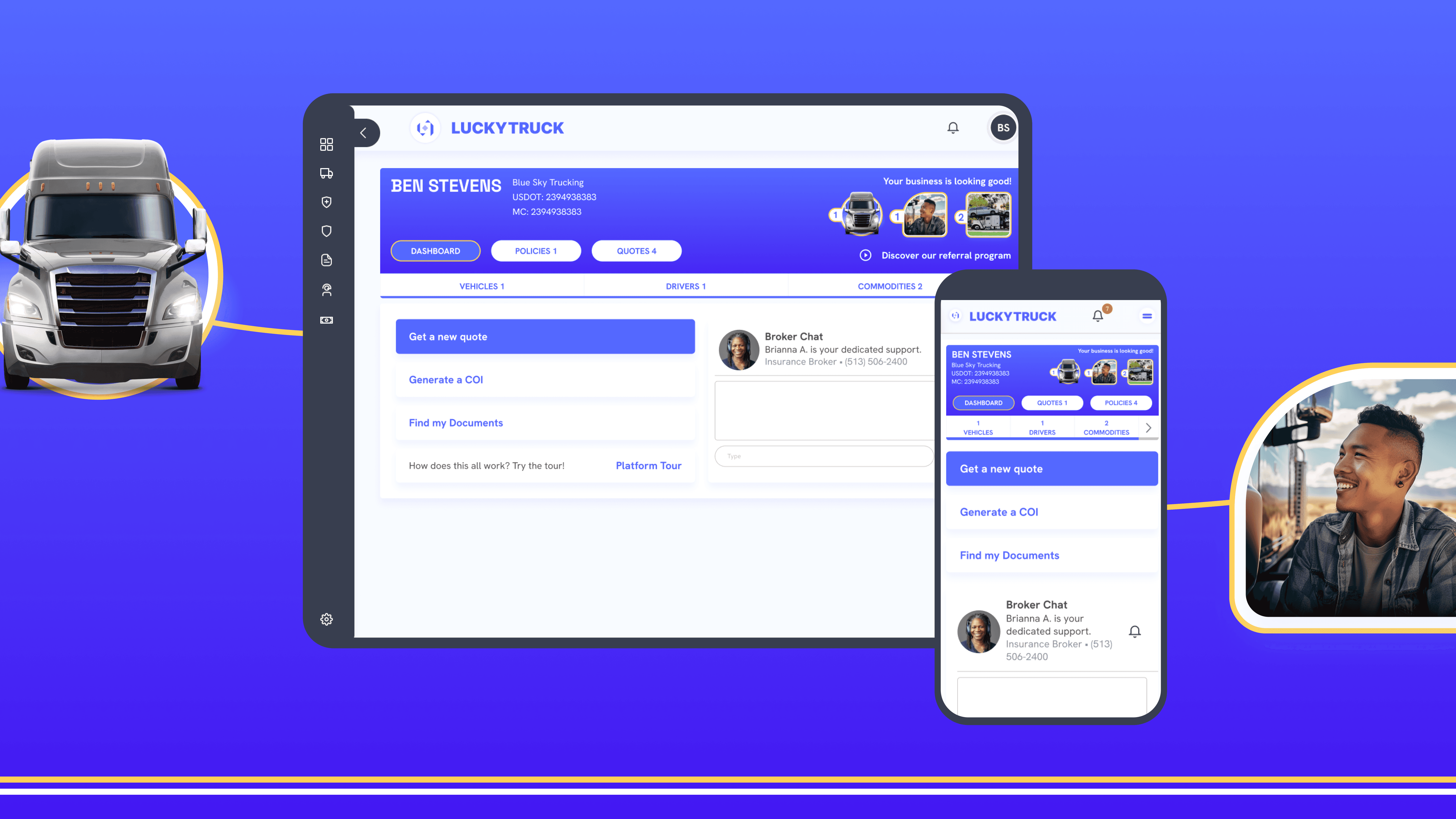
Participants in moderated research discussed the essential documents they used in their day to day related to insurance. We discovered that getting a certificate of insurance was extremely important and often used. We created a list of essential items, put them in a hierarchy, and created a dashboard that received positive reception by truckers.
After rolling out this dashboard, we discovered that users who weren't covered by LuckyTruck were using the dashboard to pull their COIs because it was faster and easier than alternatives. This added value brought new customers to the platform and proved a success to maintaining current users.


